Clients are builders from Mumbai, began a project in Pune, near the Pune-Mumbai highway. They were called Regency and the property owner was called Classic. The mix of both became brand name Regency Classic, typical and tough to brand. Looking for marketing communication to sell more homes and for a distinction in the market. Wanted to build ‘something good’, not sure what exactly.


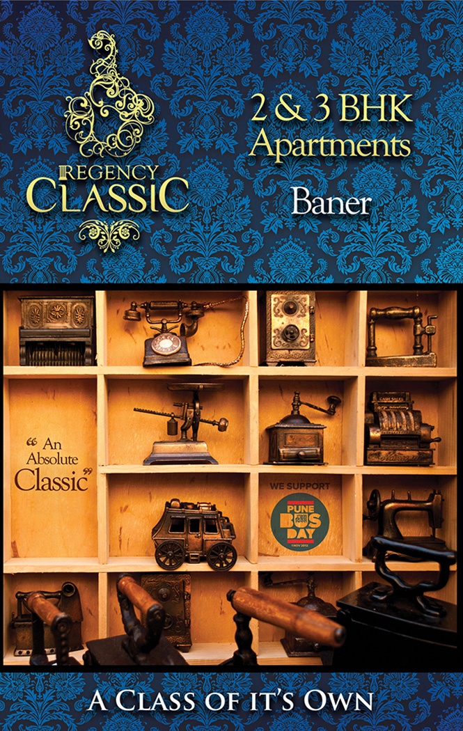
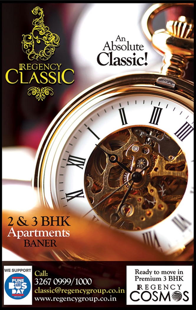
Accepting the challenge, we went with an atypical, stand-out, completely CLASSIC theme for them to set them apart from just about everyone. Created logo, brochure and hoardings for Regency Classic taking rich classical objects as focal point – gramophones, vintage cars, the like. Went ahead with aggressive hoarding campaign in the 5 km radius of the project, all over the highway. Hoardings stood out because of the iconoclastic, shaped layouts wherein the objects broke the straight line of the hoarding boundary and extended beyond to attract the eye.
Okay, then what happened: The hoarding campaign was a huge success because of high visibility. Clients sold the project well. They decided to continue with the theme and the same classical feel in all their brand communication, so we set the path for their strategy.


